commons
brand identity
As a brand identity enthusiast, I took on the challenge to rebrand commons, a creative network dedicated to empowering individuals and fostering a healthy work-life balance. Their mission resonated deeply, and I was thrilled to help them visually express their core values.

This project wasn’t just about aesthetics; it was about collaboration. Working on this project allowed me to explore the power of branding and its impact on fostering a strong community.

A Stronger Visual Voice:
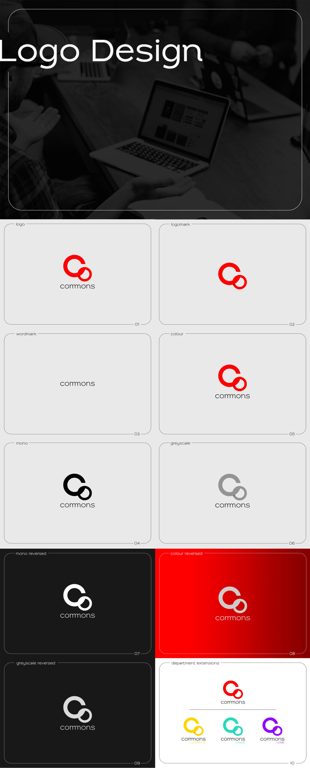
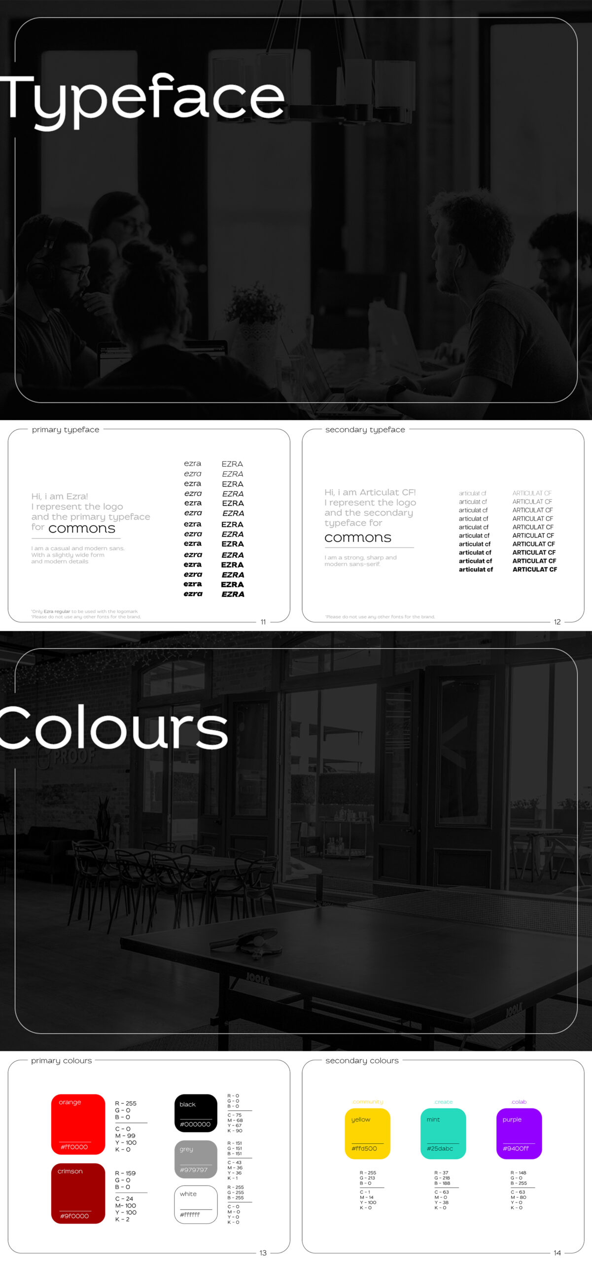
commons transitioned from a text-based logo to a dynamic symbol. The intertwined “c” and “o” represent constant growth and collaboration, while a playful shadow adds depth. Clean typography and a vibrant colour palette, with orange as the lead and departmental accents like yellow for community and mint for creative energy, further solidify the brand identity.

Collaterals that Speak Volumes:
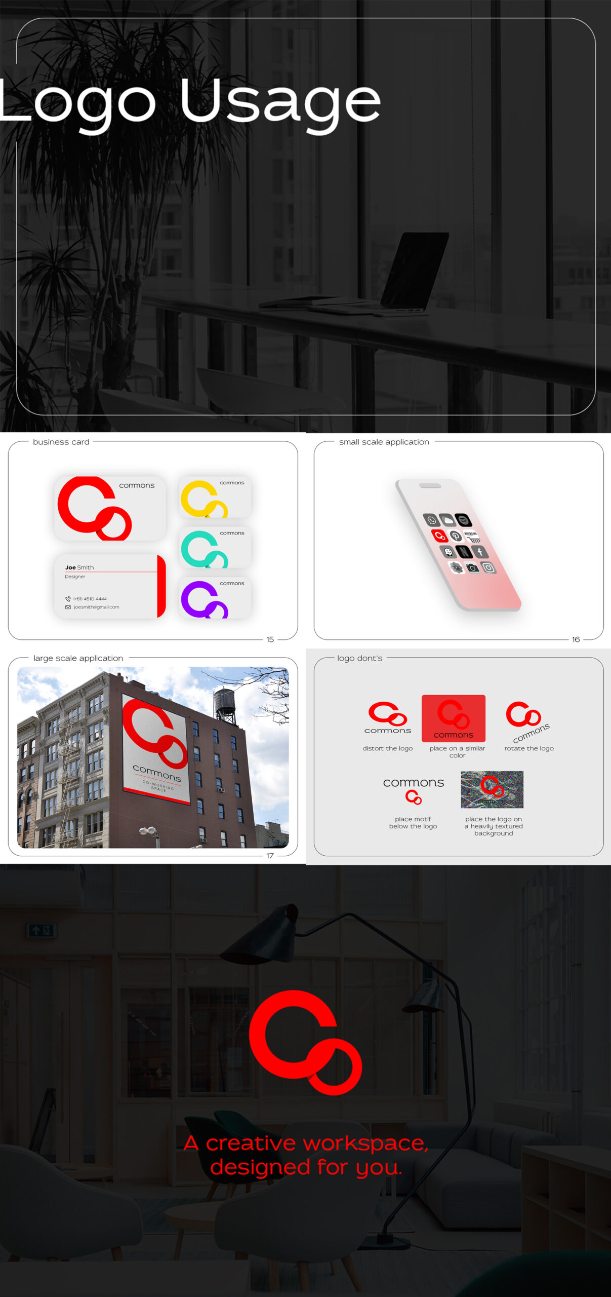
Even business cards became extensions of the brand story. Each card features the department’s designated colour and prominently displays the logo, ensuring a cohesive and memorable impression.


