vantage
typeface design
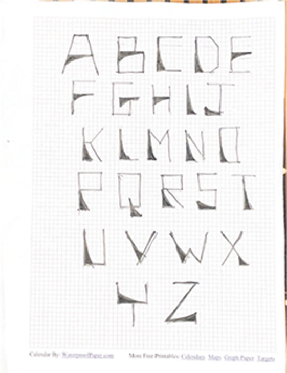
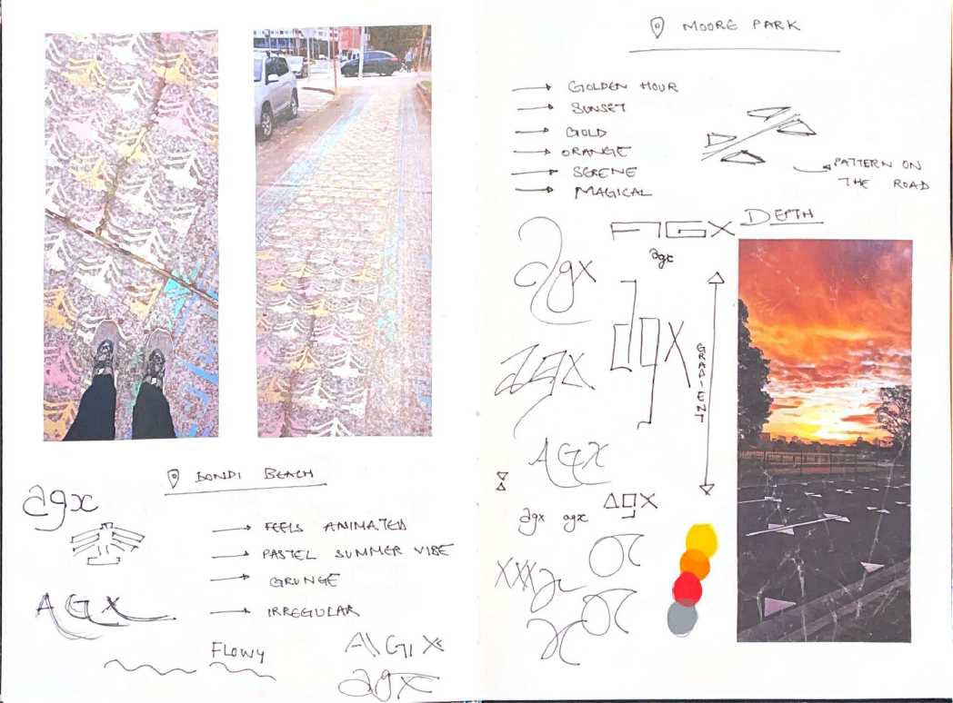
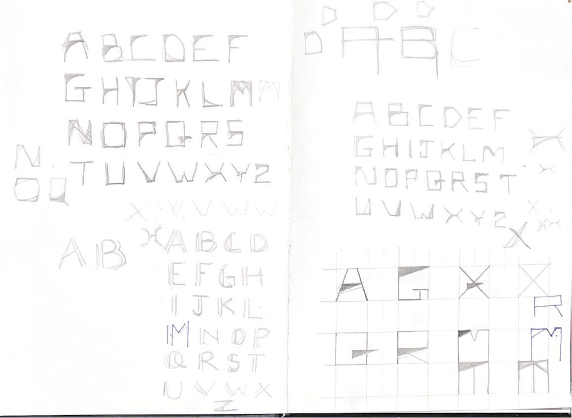
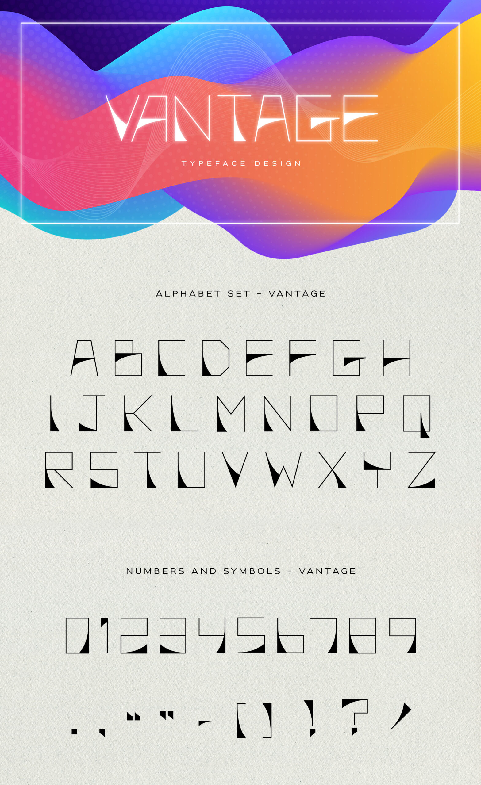
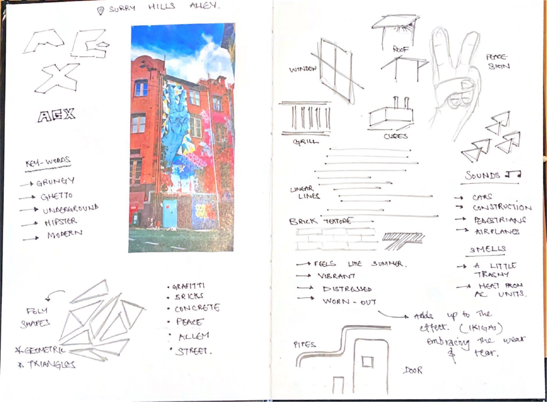
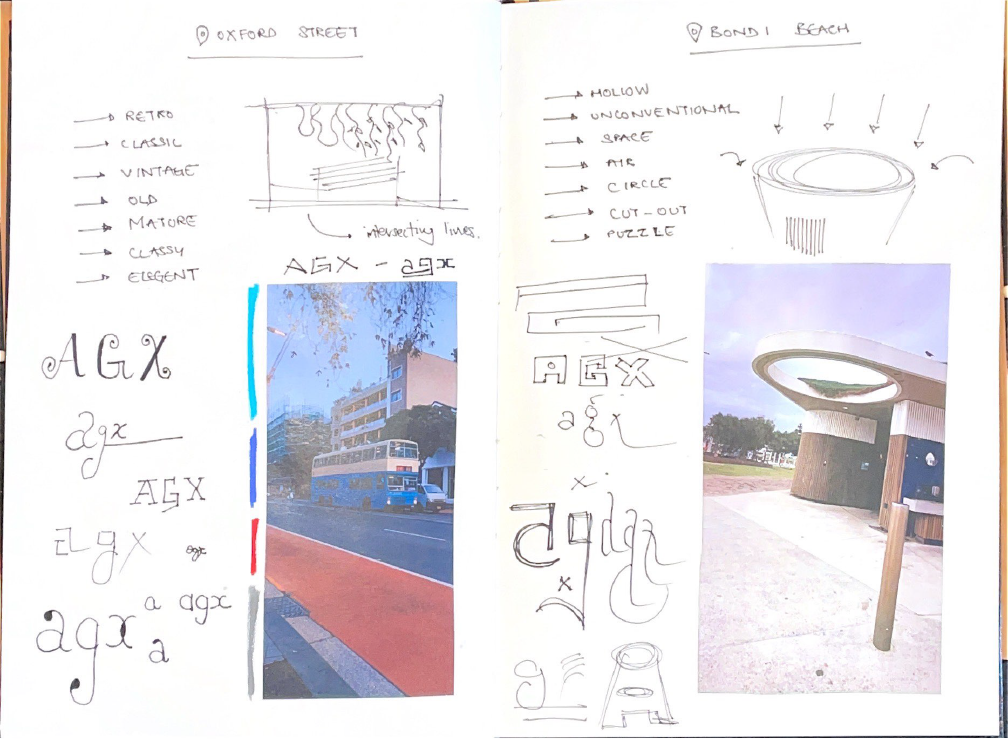
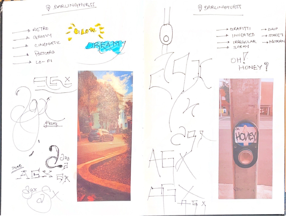
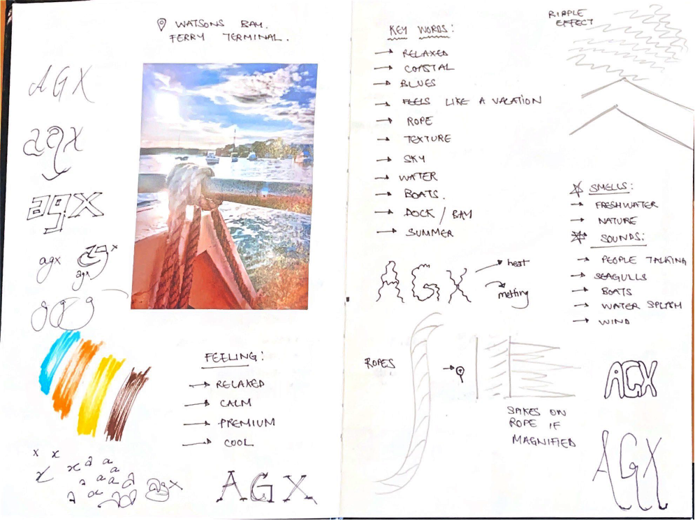
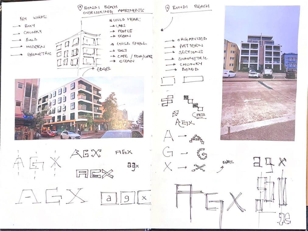
Driven by my passion for typography, I crafted Vantage, a geometric sans-serif typeface. Merging minimalism with geometric shapes and a hint of Grotesk, Vantage achieves balance and sharp legibility. Smooth curves, inspired by ocean waves, counter the straight lines for a visually pleasing effect.
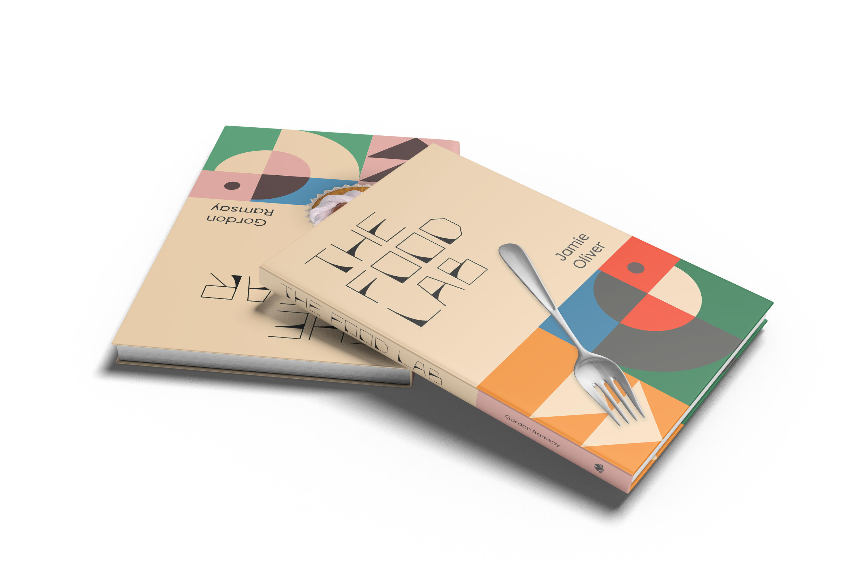
This versatile typeface shines in headers and excels in logos, quotes, packaging, and branding with its contrasting chunky and delicate elements. Vantage’s versatility is evident in The Lab Cookbook project. Its clean lines and strong presence complemented the scientific content, while the subtle curves added elegance.
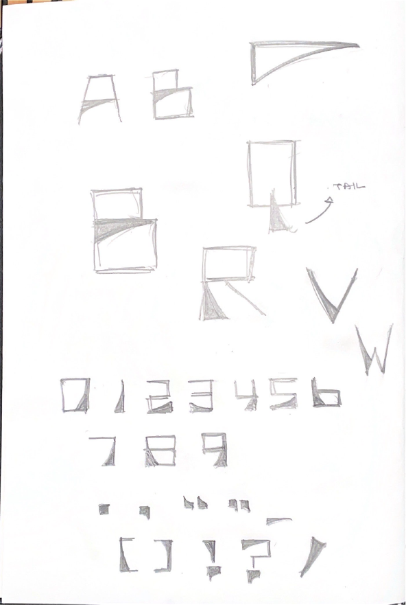
Vantage thrives in larger sizes, exceeding 24 points. Numbers mirror the letterforms, even sharing shapes with “O” and “S” for cohesion. Symbols follow suit, creating a unified visual language. The absence of rounded edges ensures characters stand out. While most letters share a curved element, exceptions like “Q,” “V,” “W,” and “X” utilize angled variations for emphasis.
